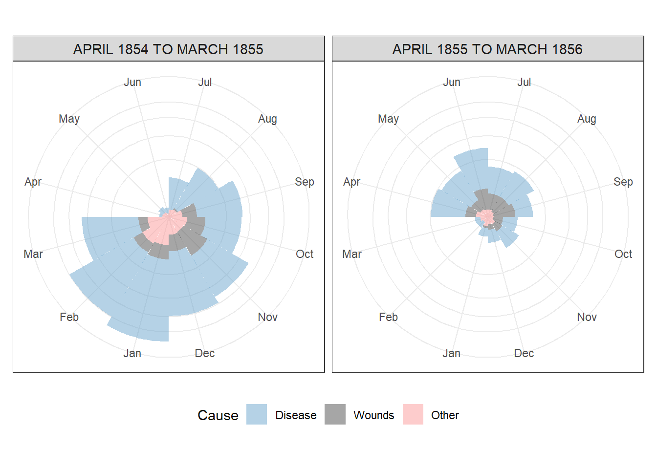
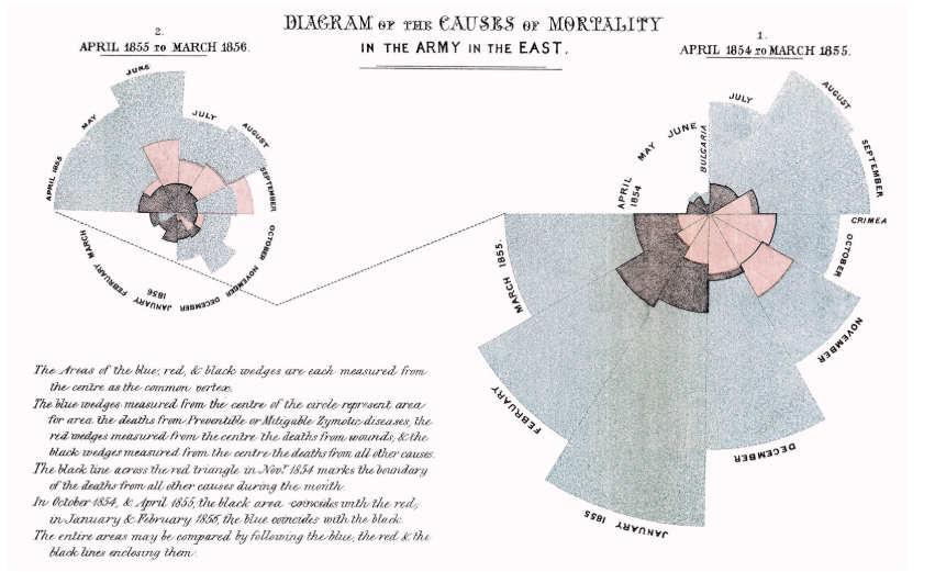
Recreating Nightingale's most famous diagram, known as the Coxcomb
Florence Nightingale showed the world that data can save lives.
Today, February 11, is recognized globally as the International Day of Women and Girls in Science. To mark this day, I recreated Florence Nightingale’s famous Coxcomb chart using R programming with hashtag#tidyverse mainly using hashtag#tidyr hashtag#dplyr and hashtag#ggplot2. It was one of the earliest and most powerful examples of data visualization influencing public policy.
Nightingale was not only a nurse but also a statistician. At a time when women had limited access to science, she used data to demonstrate that more soldiers were dying from preventable diseases than from battle wounds during the Crimean War. Her visualization changed healthcare policy. This plot is a reminder that:
• Data is powerful when communicated clearly.
• Visualization is not just decoration. It is evidence.
• Science needs more women and more visible role models.
#rprogramming #InternationalDayOfWomenAndGirlsInScience #WomenInScience #FlorenceNightingale #DataVisualization #WomenInSTEM #GirlsInScience #OWSD
## Packages
library(tidyverse)
library(HistData)

## Data
data("Nightingale")
glimpse(Nightingale)
## Rows: 24
## Columns: 10
## $ Date         <date> 1854-04-01, 1854-05-01, 1854-06-01, 1854-07-01, 1854-08-…
## $ Month        <ord> Apr, May, Jun, Jul, Aug, Sep, Oct, Nov, Dec, Jan, Feb, Ma…
## $ Year         <int> 1854, 1854, 1854, 1854, 1854, 1854, 1854, 1854, 1854, 185…
## $ Army         <int> 8571, 23333, 28333, 28722, 30246, 30290, 30643, 29736, 32…
## $ Disease      <int> 1, 12, 11, 359, 828, 788, 503, 844, 1725, 2761, 2120, 120…
## $ Wounds       <int> 0, 0, 0, 0, 1, 81, 132, 287, 114, 83, 42, 32, 48, 49, 209…
## $ Other        <int> 5, 9, 6, 23, 30, 70, 128, 106, 131, 324, 361, 172, 57, 37…
## $ Disease.rate <dbl> 1.4, 6.2, 4.7, 150.0, 328.5, 312.2, 197.0, 340.6, 631.5, …
## $ Wounds.rate  <dbl> 0.0, 0.0, 0.0, 0.0, 0.4, 32.1, 51.7, 115.8, 41.7, 30.7, 1…
## $ Other.rate   <dbl> 7.0, 4.6, 2.5, 9.6, 11.9, 27.7, 50.1, 42.8, 48.0, 120.0, …
## Data Pre-processing and Plotting
Nightingale |>
  select(Date, Month, Year,
         contains("rate"))  |>
  pivot_longer(cols = 4:6,
               names_to = "Cause",
               values_to = "Rate")|>
  mutate(Cause = gsub(".rate", "", Cause),
         period = ifelse(Date <= as.Date("1855-03-01"),
                         "APRIL 1854 TO MARCH 1855",
                         "APRIL 1855 TO MARCH 1856"),
         Month = fct_relevel(Month, "Jul", "Aug", "Sep", "Oct", "Nov", "Dec", "Jan", "Feb", "Mar", "Apr", "May", "Jun"),
         Cause = fct_relevel(Cause, "Disease", "Wounds", "Other"))|>
  ggplot(aes(x=Month, y=Rate, fill=Cause)) +
  geom_col(width=1, alpha=0.5) +
  coord_equal(ratio = 1) +
  coord_polar() +
  facet_wrap(~period) +
  scale_fill_manual(values = c("skyblue3",
                               "grey30",
                               "#fb9a99")) +
  scale_y_sqrt() +
  theme_bw() +
  theme(axis.title.x = element_blank(),
        axis.title.y = element_blank(),
        axis.text.y  = element_blank(),
        axis.ticks.y = element_blank(),
        strip.text = element_text(size = 11),
        legend.position = "bottom",
        plot.margin = unit(c(10, 10, 10, 10), "pt"),
        plot.title = element_text(vjust = 5))