Formatting axis labels in ggplot
With the ggplot2 package, you’ve got full control over the axes labels in charts. Here we are going to look at some of the most commonly needed formatting options in order to make your graph aesthetically pleasing.
Comma-separated labels
comma_format function in scales can be used to add comma separated labels. To illustrate this I use African names data set in TidyTuesday.
library(tidyverse)
library(scales)
## read data
african_names <- readr::read_csv("https://raw.githubusercontent.com/rfordatascience/tidytuesday/master/data/2020/2020-06-16/african_names.csv")
## plot
african_names %>%
  ggplot(aes(year_arrival)) +
  geom_histogram(bins = 20, fill = "darkslateblue", alpha = 0.7, col="white") +
scale_y_continuous(labels = scales::comma_format()) 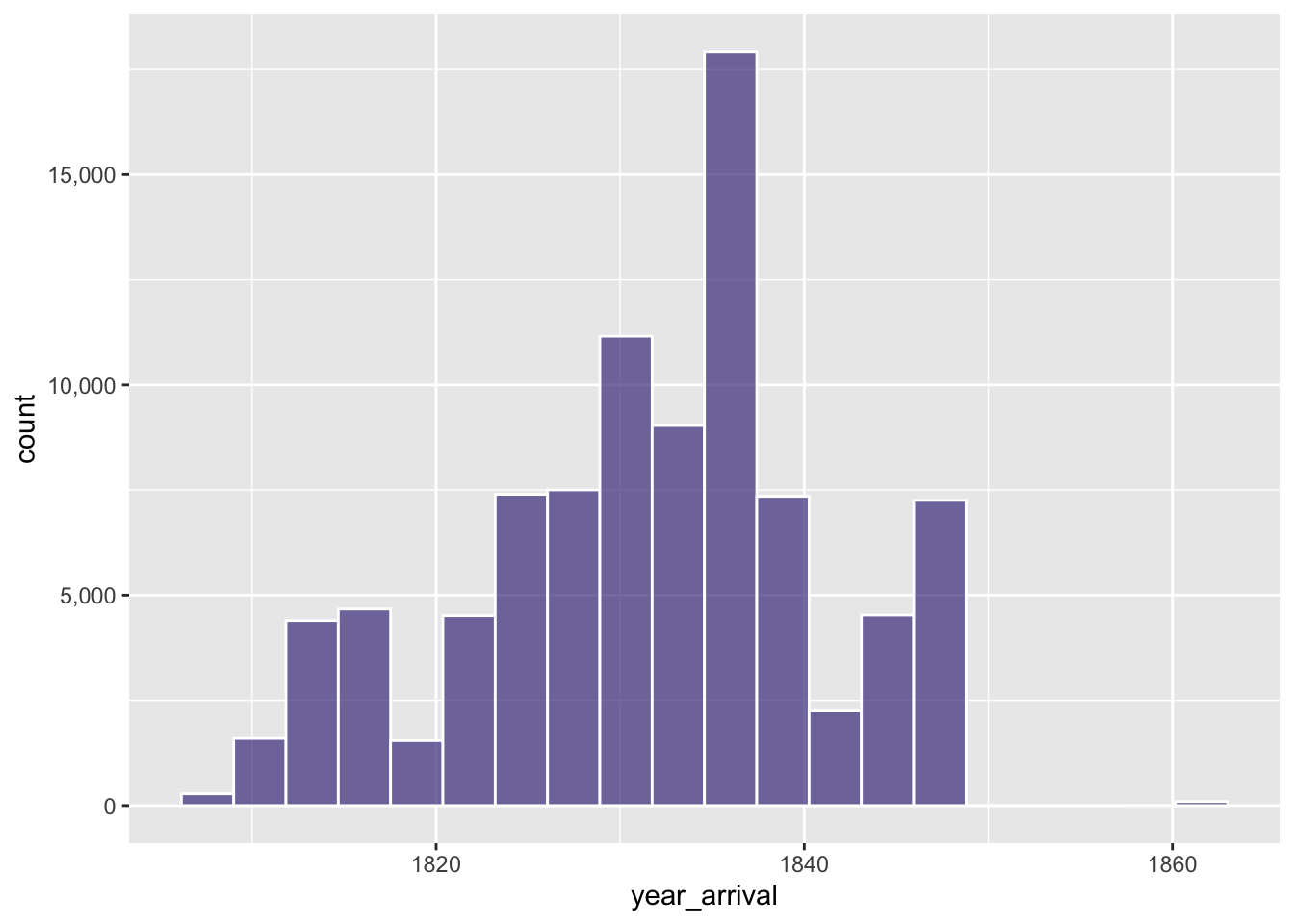
Change label angles, horizontal justification and vertical justification
Angles only
The ggplot2 package element text can be used to alter the label angles as well as the horizontal and vertical justifications.
library(palmerpenguins)
penguins %>%
  ggplot(aes(x=species, fill=species)) + geom_bar() +
  scale_fill_manual(values=c("#1b9e77", "#d95f02", "#7570b3")) +
  theme(axis.text.x=element_text(angle=30))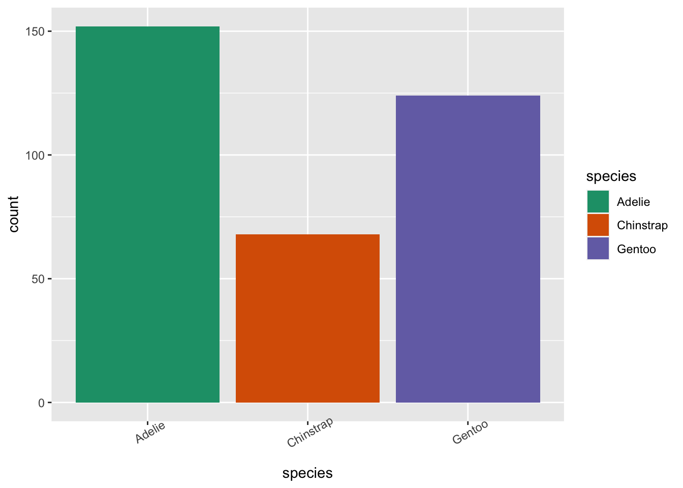
Angles, horizontal justification and vertical justification
penguins %>%
  ggplot(aes(x=species, fill=species)) + geom_bar() +  scale_fill_manual(values=c("#1b9e77", "#d95f02", "#7570b3")) +
  theme(axis.text.x=element_text(angle=30, vjust=.8, hjust=0.8))